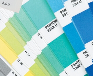
 Able to alter a mood, stimulate hunger, invoke peace or incite rage, colour is a very powerful thing. By using colour in your printed communications, research shows that you can create maximum impact, increasing recall and response. But with so many colour options to choose from, and so many different ways to apply it, it’s hard to know where to start.
Colour symbolism provides insight into the way colour is used throughout different cultures. It is something often taken into consideration when companies are selecting their corporate branding colours. McDonald’s for example is often mentioned for its use of red which, according to some researchers, can stimulate the appetite. More obviously though, the colour red is bold and eye-catching and will help your printed material stand out from the pack.
For brands not requiring the audacity of red, other colours still provoke interest, as well as invoke other thoughts. Green for example has been tied to many different cultures, ideas and items. Considered a lucky colour when linked to the Irish, green is also the colour of the currency in the United States. Conversely though, green is highly symbolic of the environment and nature, and is known for its calming properties.
Similarly, blue, with its ties to water and clear skies, is also known to invoke feelings of tranquility. On the hand though, blue can also symbolise depression and winter. Most notably, lighter shades of blue are often used to signify that which relates to males, as pastel pink does for females. These can be useful and relevant colours if your company’s services pertain to a particular gender.
Kwik Kopy’s graphic designers and Account Managers can help you determine what colours will best suit your brand and how they can be utilised in your printed materials. With a wide range of paper stocks, printing options and finishing services, Kwik Kopy are on hand to colour your world.
For more handy design and printing tips, head to your nearest Kwik Kopy Centre.

