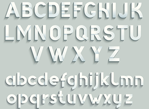
 In today’s world, typography has become quite the art form and it plays an important role in how your business marketing and content presents both offline and online.
Choosing the right fonts can make all the difference when it comes to people focusing on what you’re trying to tell them.
Here are some typography guidelines to keep your business on the right track.
3 Typography DOs
1. DO apply contrast
You don’t need to have different colours and fonts but you do need at least one contrast to create a point of difference. Avoid fonts that are too similar as they can be confusing to your target market. Different font weights can work well (bold, light, book) as does pairing a serif and non-serif font.
2. DO let your words breath
It’s important to give your words room to breathe to maximise the readability of your messages to your audience. Check there is enough space between letters, lines and paragraphs so that your target market can read and understand your message.
3. DO make sense
Great layout creates a much stronger sense of clarity with your audience. No business wants people squinting to make out the words in their marketing efforts. Typography should have visual appeal, but above all else it needs to make sense if you really want to get your messages across.
3 Typography DON’Ts
1. DON’T be foolish over fonts
Don’t get carried away with the font choices out there and always think about the purpose and feel of your marketing materials and content when it comes to choosing the right typefaces. 2-3 complementing fonts is all that is needed to keep your designs clean and professional.
2. DON’T shadow everything
Some shadowing can add creativity and depth to your design (e.g. a coloured shadow instead of a grey one) but be very careful and sparing in its use. Not all shadows are cool and in fact some can look dated and reduce the appeal of your designs.
3. DON’T overdo things
With the endless release of design tools that let us make all sorts of changes to the typeface, it can be easy to get carried away. But when it comes to your business it’s important to convey the same look and feel with all your artwork so that there is consistency throughout.
For more tips on how to use typography to create the right impression for your business, speak to the team at your local Kwik Kopy today.

