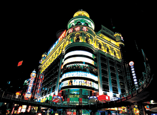
 Standing out in front of an audience or other expo booths at an event means smart use of signage. When having a booth or a stage at a small expo or a global expo, signage needs to be at the forefront of your event planning.
Your signage needs to project your company’s style and brand, professionally. We are all visual creatures and like they say, first impressions stick. Well-designed and strategically positioned signage will ultimately decide how well your company performs at any one event.
First, let’s discuss what is required for good signage and why it matters. Then we will take a look at some event signage ideas from a small handful of the world’s biggest corporations.
Great Signage: What’s Required?
The best signage ideas are usually successful because they align with the following attributes.
- First impressions stick. You’ll never get a second chance at a first impression, which is why it’s so important to get signage right the first time. The first experience your audience has with your brand will start to shape their perceptions and feelings towards you and your product, so make sure you leave your mark!
- Consistent branding. Companies with good signage understand the value of a consistent brand experience. Consistent branding not only reinforces your identity but also helps establish feelings of trust, authority and security with your customers.
- Good signage understands that colour is invaluable and impacts on an audience’s feelings. Understanding the mix of colors, simplistic or dramatic, will help your company see through the eyes of the audience.
- Good signage understands why clear contrast is part of impeccable design. Colour is invaluable but having the right mix of textures, patterns and aesthetics is also important.
- They go big. Top to bottom, side-to-side. Good signage makes the most of its real-estate and is always strategically placed.
Take a look at some examples of the world’s biggest corporation signage from around the globe.
Apple
The eye-candy display of Apple signage at the 2013 WWDC (Worldwide Developer Conference) was everything but small. The tech giant displayed large billboards splashed of rainbow colours with the iconic apple symbol literally posted around the event location.
The signage played a role in announcing the greatly anticipated updates of existing apple products.
Apple as usual displayed great visual communication to consumers on a global level. Apple doesn’t just do well because of the iconic apple symbol; they do well because they are consistent with their branding yet always innovative when it comes to signage for new events.
BMW
Take a stroll through any annual car expo with brands like BMW, Mercedes, Jaguar and Ferrari and you would expect nothing less than absolute class. First class that is.
BMW does exactly this. The motor vehicle giant always has impeccable design throughout their brand signage and is innovative in their use too. BMW takes their signage to new levels, in some cases building their own showroom within a showroom.
The company takes up a lot of room and turns a lot of heads by placing the BMW logo on trade room floors and across whole walls from bottom to top. Transforming shared showrooms into their own with the almighty BMW logo hanging from the roof.
BMW is a great display of first class consistent branding. From the ground to the ceiling, BMW makes sure they are seen from every corner of a trade room floor.
Billabong
An Australian iconic surf brand, Billabong’s exhibitions lay largely on the sand. Billabong is a great example of using the opportunity to position themselves in different venues, like a beach break or across landscape, in order to create theatre and excitement.
Billabong’s branding during surf competitions is planned to ensure the brand can have the greatest visual impact. The surf brand ingeniously places their signage on the sandy beaches so the Billabong logo circulates the beaches where spectators stand.
Strategically positioning their signage on a surfer’s wet-shirt and board, on the ocean buoys, to the judging table, to the trophy podium, they cover all worthy positions. Take a look at the signage at the 2013 Billabong Pro in Tahiti.
We love using Billabong as an example of a brand that has a different event venue from the majority. Billabong remains strong in keeping their branding consistent on the beach and in the water. Their black and white logo brings an invaluable impact to an audience and their signage is always big.
It’s clear that these are some of the world’s greatest leading brands for a reason. They know how to make a big splash on the world stage and their consistent and creative signage plays an important role in their success.
To recap, to stand out from the competition on the showroom floor remember a few simple things.
- First impressions stick.
- Be consistent with your branding.
- Be creative with your signage colours but make sure they project the right impact on your audience.
- Go big on the showroom floor but re-think your venue strategy like Billabong if you’re not on a show room floor.
If your business needs a hand with signage ideas or some advice on event signage then contact us today!
