Photo Credit: jacobe.mathilde via Compfight cc
Have you ever stumbled across a creative hotspot or a website on the Internet that absolutely captivated your attention? When so many blogs and websites on the Internet serve a very specific purpose, it can be a real relief and a breath of fresh air to cross paths with a designer’s creative expression, and it’s something that should certainly be celebrated.
We’re looking at websites that really take the cake in terms of expressive freedom and fun in the form of art. As a medium, you’ll find our examples demonstrate so much more than artistic capability. It’s a mix of skill, industry training, and a real love for what technology has to offer the modern designer.
Here are ten websites to help you relax and possibly lose your coffee break over. Enjoy!
1. Open That Window – www.openthatwindow.com
Designed by: Rafael Rozendaal
The concept: Need a breath of fresh air? This site seems to be a celebration of gradient tones, something you might expect from opening a window on a beautiful day, or perhaps closing it on a bad one.
Why it works: This site adds another dimension to user interaction and browsing, giving the reviewer an opportunity to move between windows the way they might in real life.
2. Deep Sadness – www.deepsadness.com
Designed By: Rafael Rozendaal
The concept: Colour, Shape, Dimensions, plus negative and positive space.
Why it works: Who doesn’t love a colour explosion? A single click will reveal a brand new combination of two colours, and two shapes, one negative, and the other positive. Each image is harmonised perfectly, and kick starts your mind, inspiring and energising the viewer.
3. Neogeocity – www.neogeocity.com
Designed By: Rafael Rozendaal
The concept: It feels like passing over the tops of hundreds of psychotically lit buildings, gliding like a bird as you navigate directions using your mouse.
Why it works: Neogeocity captures that powerful combination of convincing navigation, magnetic colour combinations and all consuming curiosity. What’s next?
4. Break Glass to Sound Alarm – www.breakglasstosoundalarm.com
Designed By: Anonymous artist
The concept: Perhaps your inner delinquent beckons or you just need to vent on some frustration? This site gives the viewer the opportunity to reclaim their unleashed youth and move on as if nothing happened.
Why it works: Who hasn’t wanted to break the glass and run away?
5. Room Warp – www.roomwarp.com
Designed By: Rafael Rozendaal
The concept: This site gives the reader an opportunity to view a room from every warped angle. The room being comprised of five main colours that bend and reshape according to whichever direction you navigate with the mouse.
Why it works: Rozendaal is a master of colour. Viewers get to choose the perspective, be the artist as much as the audience. It’s simple and fun.
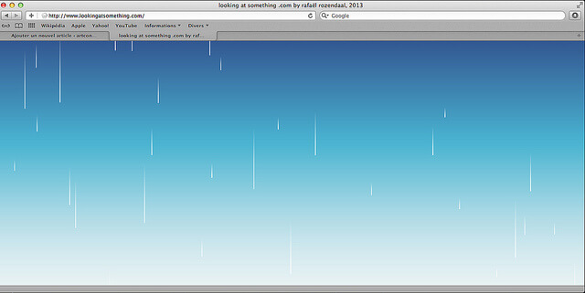
6. Looking at Something – www.lookingatsomething.com
Designed By: Rafael Rozendaal
The concept: This glorious installation is a great way to visualise your appreciation for rainy days. The more extreme the position of your mouse, the more extreme the weather conditions become.
Why it works: This site is the rainy day you’ve been waiting for…from the comfort of your screen, it’s hypnotic, mesmerising and completely beautiful. What more could you want?
7. Hot Doom – www.hotdoom.com
Designed By: Rafael Rozendaal
The concept: Another beauty by Rozendaal, this dramatic site captures an expressive take on volcanic activity by using flat colour, on a black backdrop.
Why it works: The mind is absolutely captivated as each explosion waxes and wanes.
8. Essay Typer – www.essaytyper.com
The concept: Something for those NOT intending to formally hand an essay in to an authoritative body. As you type random button sequences, you’ll see a validly written essay appear before your very eyes.
Why it works: Lovers of novelty and facts can feast their eyes on this content. NOTE: All content is automatically drawn from Wikipedia and is absolutely not fit to be submitted. This site is for funsters use only!
9. Ducks are the Best – www.ducksarethebest.com
Designed By: Anonymous artist
The concept: Do ducks quack you up? With just a few moments pondering the greatness of this website, you’ll be wholeheartedly agreeing that if they’re not the best, they must be pretty close to, at least in the artists’ book.
Why it works: This site leaves the viewer in control, navigating with your mouse leaves a streaky trail of ducks wherever you may roam on brightly lit, highly contrasting colourful backgrounds.

Photo Credit: resonate.io via Compfight cc
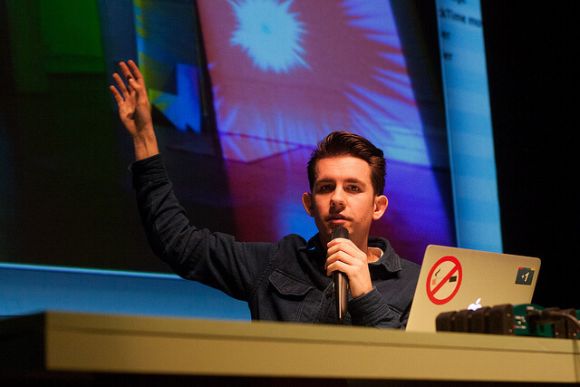
You may notice that most of these websites are the work of Amsterdam born Rafael Rozendaal, the New York based visual artist. From a young age, Rozendaal realised that once he sold his work, he was very likely never to see it again, and this inspired him to use digital art as a medium. Rozendaal considers the Internet as a free space in which to build a connection with his audience. This is certainly a new and extremely unlikely concept for some viewers, but it’s a growing interest and certainly a valid mode of expression for creative designers that really love the opportunities digital art embraces.
How does each site strike you? Whether you perceive sites like these to be art or a pointless and time consuming endeavour, the argument is hotly debated by creative web design enthusiasts the world over. Could you potentially create something to be considered more artistic than purposed and what’s the most artistic website you can find on the Internet? Share your discoveries in the comments below!

