As the year progresses we decided take a look at the top 5 web design trends for 2014! Let’s take a look at what to expect this year.
Flat Design Grows in Popularity
With the release of iOS7 in September 2013, the world quickly sat up and took notice of the newly refreshed interface revealed by Apple. Also favoured by rival Microsoft, the sleek, minimal ‘flat design’ is a far cry from the once popular skeuomorphic design, which dominated the screens of millions of computers for many years. Skeuomorphic design attempted to bring real life features to the screen such as the bookstore’s timber shelves, the notepad’s lined paper and the leather bound calendar. These used drop shadows, 3D design and faux-real life details.
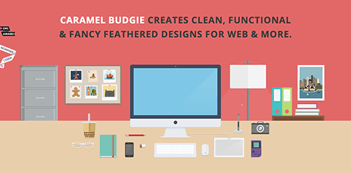
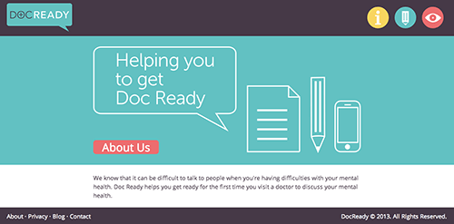
Flat design is the exact opposite and strips away all of the artificial design techniques and replaces them with a more simplified, modern, clean, 2D design. Caramel Budgie and Word Doc websites are great examples of flat design where the aim is to improve the user’s web experience by removing any unnecessary clutter. Easily identifiable ‘flat’ icons are complemented by a bright pop of background colour for easy access and reference.


Streamlining Functionality with Aesthetics
As a by product of flat design, comes the need to design user centric websites which support the user journey as opposed to a design led piece of art. By getting back to the basics and stripping away the bells and whistles the site can focus on it’s actual job and not hide behind its pretty face.
Design for Mobile First
Planning and designing your website around mobile is not just an option anymore, it’s an essential. Start your design process with mobile first before moving onto tablet then finally the desktop. If you’re unable to fit everything from your website onto the small screen, chances are it’s unnecessary on the desktop too.
Consumers are using websites like an application so you need to ensure your website design is responsive or ‘adaptive’. The big advantage of this trend is that your website will work on any device.
Image and Layout Inspiration from Print and More Typography Options
Just like in magazines large, vivid, compelling images are used to capture attention and tell a story. Large images will be used more and more across websites in 2014 as backgrounds. Large images perform so strongly in social media channels delivering larger volumes of engagement and connection which can also translate onto a website. With the increase of content creation website layout is taking a cue from traditional magazine design of simplicity and white space with emphasis on the content.
The great news for designers is that we are no longer restricted to only a select few web-safe fonts. Designers can now play around with Google Fonts and Typekit. Along with the trend of simplicity, clean, streamlined design comes the reduction in multiple typefaces. Stick to 1 to 3 typefaces.
Navigation
Mobile devices have started to alter the navigation design particularly on desktop where sidebar navigation is gaining popularity. Buttons will still be popular in 2014 but the trend is to make them big, bold and easily seen. Sticky navigation provides an easy way to attach elements to the page so that when a user scrolls up or down, the elements you choose are always visible. Long pages and continuous scrolling will continue to grow in 2014.
Whether you are designing a new website from scratch, looking to give your existing one a refresh or wanting to simply tweak a few elements the key trend for 2014 is to ultimately design for your user, and of course mobile! Will you be taking up any new web design trends in 2014?

