A poster is a great way to capture attention in a busy marketplace, but how do you make your posters stand out from the crowd?
Here are our top 6 tips for designing posters that really stand out…
- Make the Words Count
Write a snappy headline and keep the content short and to the point. Lose any irrelevant information and make sure that every word is vital. Choose your words carefully and incorporate powerful language to capture attention.
- Use Bold Images in your posters
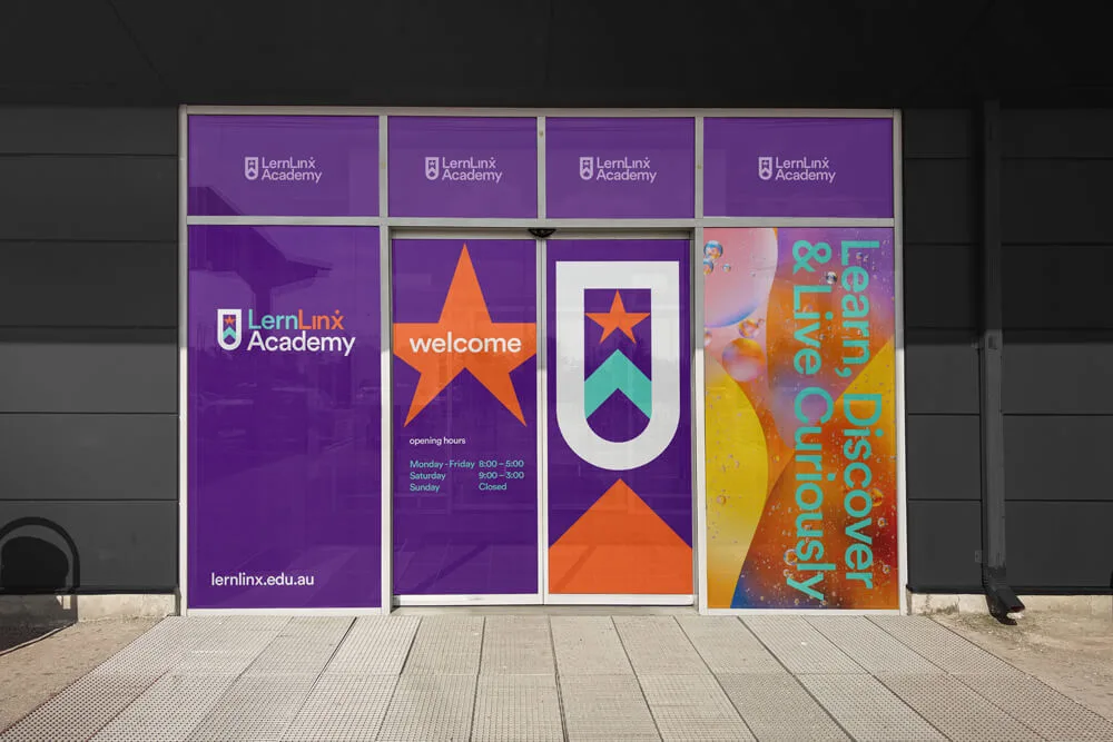
For a stronger message, use one large image instead of several smaller ones. Use images that tell a story, or stimulate emotions. A great image will draw readers in and be a focal point for your whole design.
- Focus on the Benefits
Design the poster with your audience in mind. Answer the question: What’s in it for me? – Making sure you write from the audience perspective – avoiding words like I, we and us.
- Grid it Out
Align items to a grid to make sure your design is well balanced. To avoid printing issues once the design is completed, make sure you create your design with printing margins and bleed areas in mind.
- Keep Posters Simple
Stick to two typefaces and try to incorporate some white space into your design. Just because you have a lot of space doesn’t mean you need to fill it all up!
- Proofread and then Proofread Again
One small mistake can derail all your hard work – so make sure you proofread your design. If you’ve been looking at the design for a long time you might not notice mistakes, so ask someone else to check it as well – before giving it the final OK to be sent off to print.
If you need help designing the perfect poster for your campaign, speak to the team at your local Kwik Kopy today.

