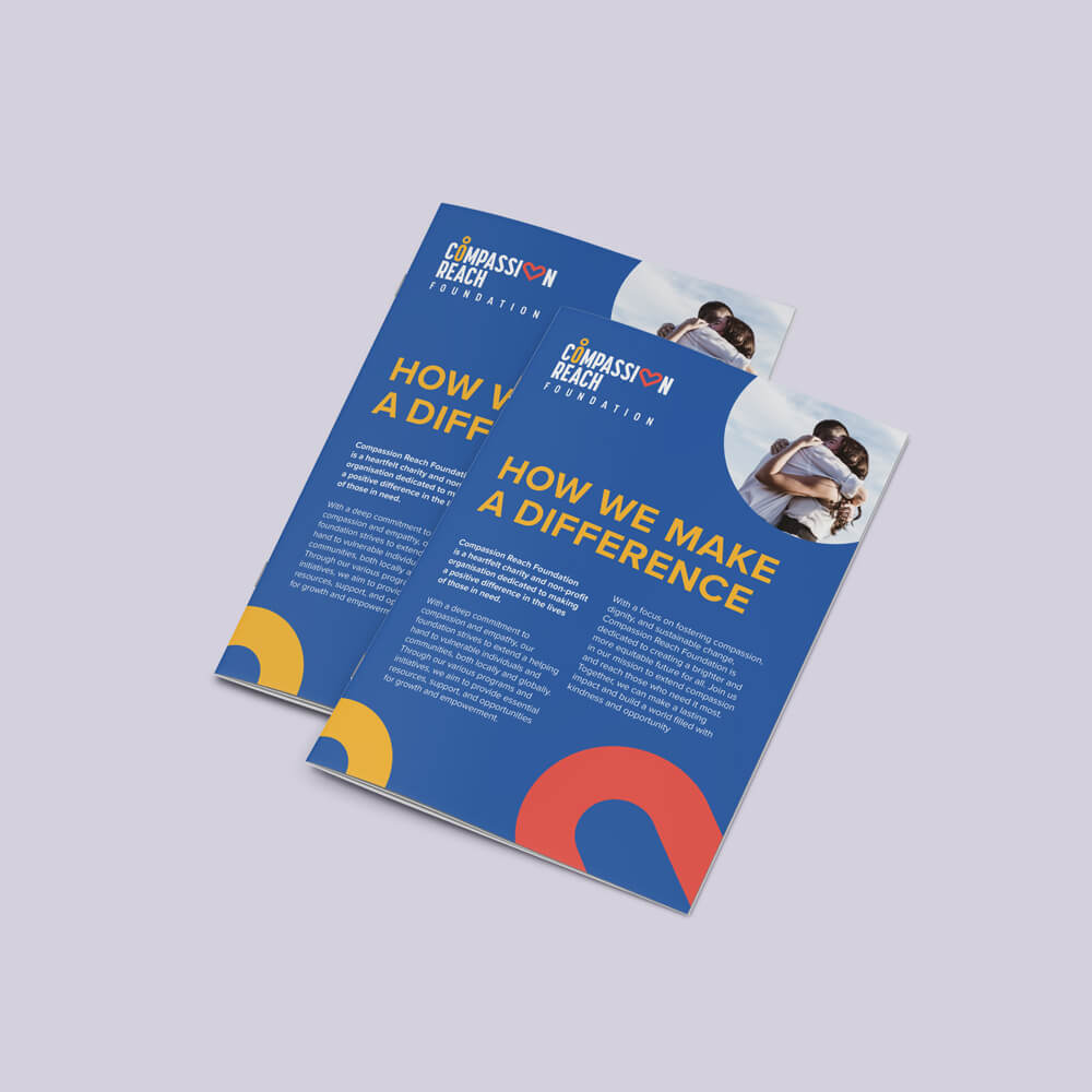
The type of stationery you use says a lot about your business and if you want to project a professional image then your letterhead design needs to convey this too. The design of your corporate stationery should always reflect the type of image you want your business to portray.
Make sure that you don’t overlook corporate stationery as part of your overall marketing strategy. Whether you want your stationery to make a strong first impression with your customers and prospects or you want to reinforce your brand identity, here are some tips to help you get your design just right.
4 Tips for Updating your Business Stationery
Reflect your Branding
Your branding strategy should be incorporated into your stationery design so that people know it’s your company and understand what you stand for. Matching colours to your logo is a good idea to create a professional image and brand consistency.
Be Easy to Read
Remember that any text featured on your stationery should be in fonts and colours that are easy to read. A busy design can distract people from noticing important details. Remember to include plenty of white space to help your message stand out.
Include Relevant Contact Info
If you want your business stationery to be effective then you need to include your contact information. This means your company name and address, phone number, email, website and any other details your customers need to know.
Choose Quality Stock
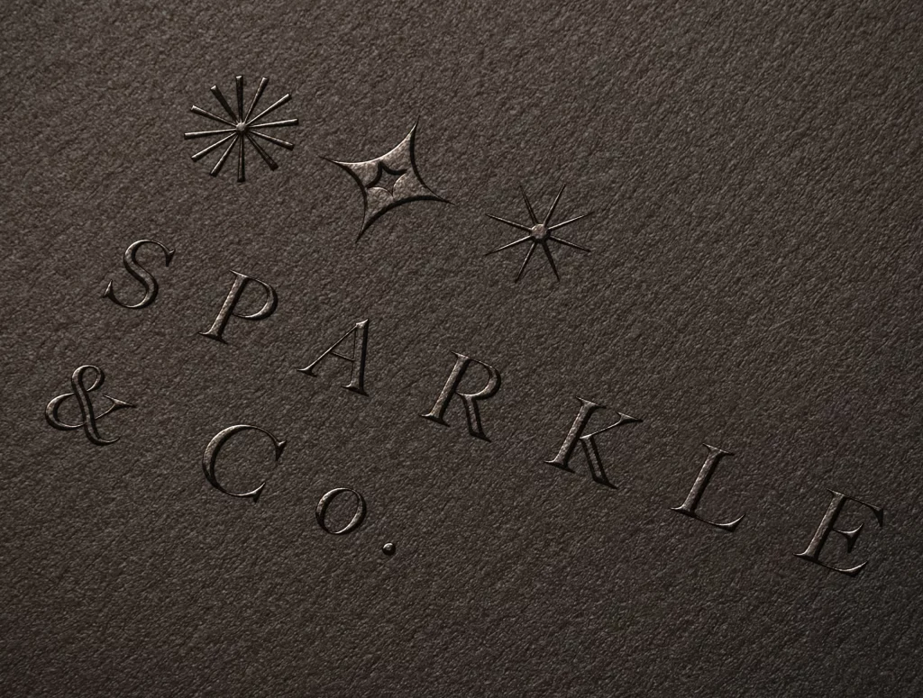
Using quality paper stock for your business stationery can help promote credibility for your business. People notice small details such as professional looking paper and special finishes (e.g. embossing), which can be enough to alter the perception of your business in the mind of a prospect.
For quality stationery design that creates a great impression for your business, speak to the team at your local Kwik Kopy today.


